Mark of Nahr Price Pressure
The Mark of Nahr is an item that is required for the creation of the Combat Log. Like most ship tokens, it is a low volume item and rarely gets highlighted on the market. It usually shows up on the Price Guide with little to no market capitalization. As a result, a manual check is required to verify if this had an impact in the overall price.
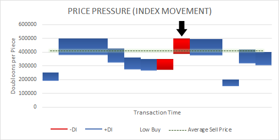
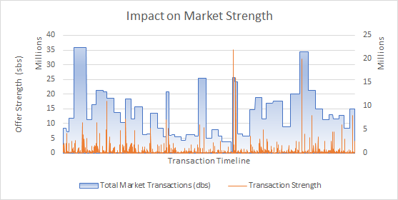
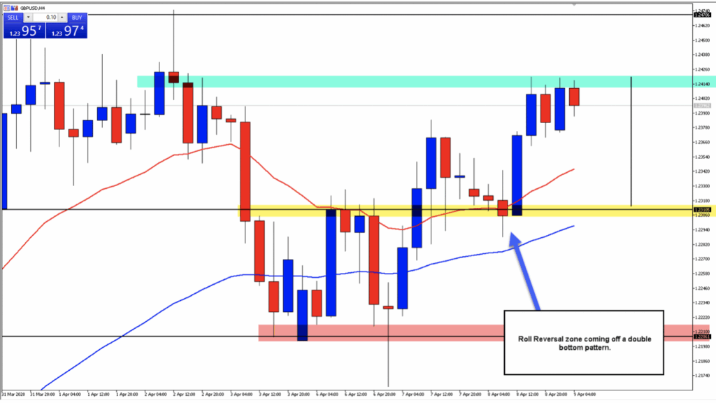
Luckily, transactions for the Mark of Nahr show up in algorithm and we are able to verify the movement of these items in Tradelands. The chart above shows the pricing pressure, meaning the buy/sell activities that are attempting to move the price in a specific direction. The black arrow shows a specific sale which we verified earlier this week. Unfortunately, this specific analysis isn’t usually posted on the website due to the complexity of the data used to represent it. However, we are able to provide it on request.
To read this chart, there are a couple of things to know:
- A blue bar indicates pressure to raise prices (or keep them consistent) with the size of the bar representing how hard they are pushing.
- A red bar indicates pressure to lower prices with the size of the bar representing how hard they are pushing downward.
- The green dotted line indicates the current market price that results from all this pressure and is an indicator of how the market will perform in the future.
In the case of the Mark of Nahr, it looks like two sales, one at around 500k and another at 350k, are creating most movement in prices. The price guide currently shows this item selling at $381k, but based on the green dotted line being at $410k, this indicates the price of the Mark of Nahr is expected to rise. That means, if you are thinking about investing, now is a good time to pick one up if you can still get it under the $400k price point.
Explain This Thing
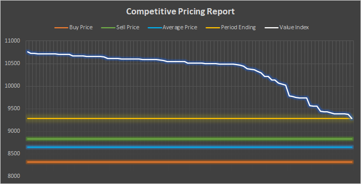
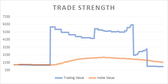
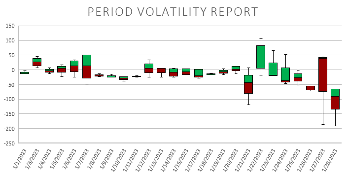
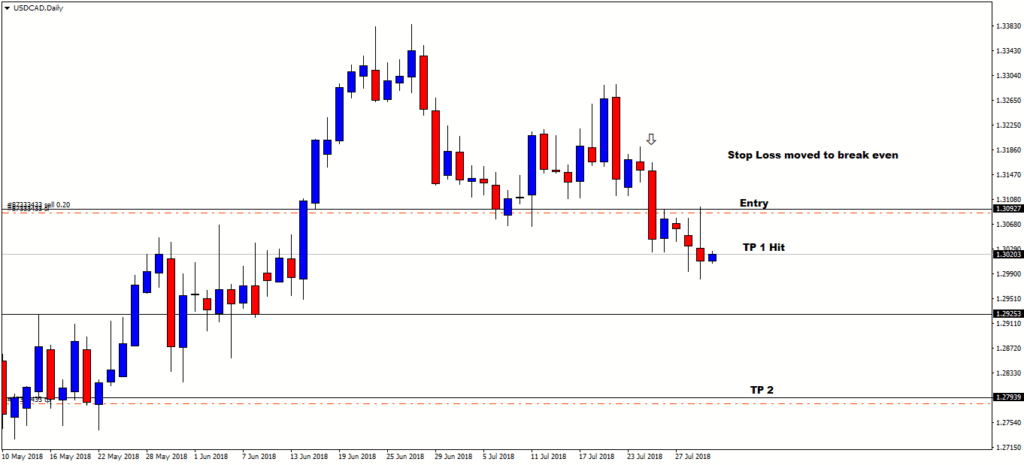
If you are confused as to what all this means, you are not alone. This website was created in order to helps simplify trading in Tradelands for this very reason. The data shown above is our version of a real stock-trading algorithm called a push-pull analysis, sometimes called the Directional Movement Analysis. Here are some examples of what they look like in the world of stock trading:
These diagrams, as well as the data they represent, provide information used by traders to make transactions. Whenever you are watching the news and see a stock ticker scrolling across the bottom of the screen, it is effectively showing a point in time value of that stock. This data, just like our system for Tradelands, tracks this over a period of time and allows you to visualize where things are headed. This allows you to make investment decisions based on data rather than just word of mouth.